A logo redesign for Numbers House, an accounting and business management company. The company is located in an old house so it was important for me to retain that shape in the logo. The redesign gave the company a much more mature and respectable look while maintaining familiarity to its customers and local audience.
Old Logo
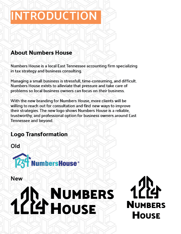
The original Numbers House logo seen on the right appears quite childish and inappropriate for an accounting firm. Using elements of the old logo and the foundations of the company, I redesigned a new logo and branding.
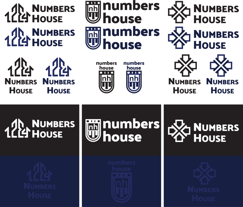
Logo Development
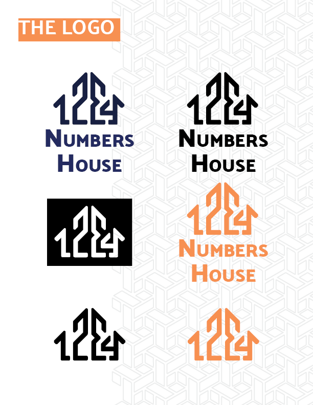
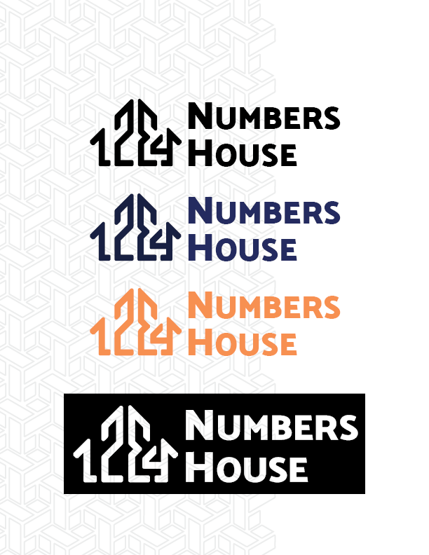
Here you can see the development of the logo. Starting with many ideas and then forging them into three versions of the logo I liked. From this point I could test them on different background and in different orientations to see which worked best.
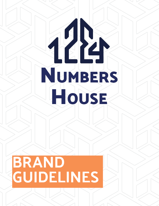
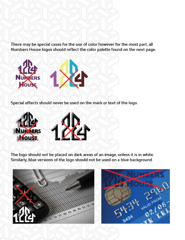
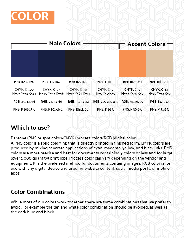
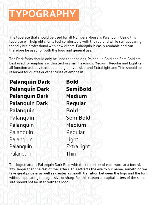
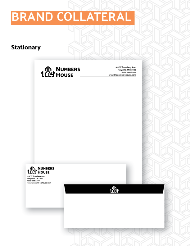
Brand Guidelines
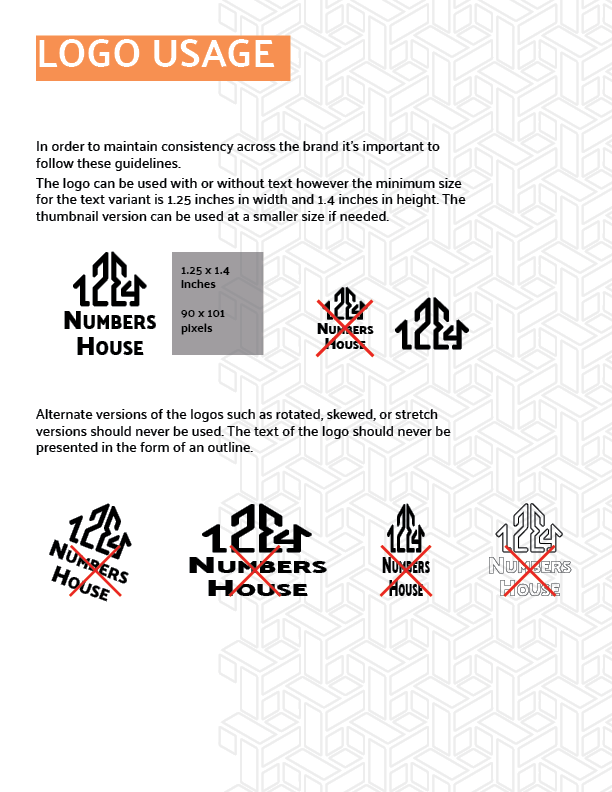
With the newly chosen logo, I also made an entire branding guideline for Numbers House.
For the best experience, view it here on issuu or see each page individually below.